Customer Satisfaction

Less frustration, happier customers

Success Rate

Increased task completion rate

Site Performance

Faster page load times

First Responder Network Authority

Redesigning the First Responders' Dashboard


The Problem

The Premier flows do not support the needs of our First Responder sub-paid customers. The Premier pages and flows were designed to help large businesses service their accounts, view and pay their bills and shop. The paths to important information and task flows on the current dashboard were unclear and overly-complicated for a First Responder sub-paid user who, in essence, is a typical consumer who expects a simple account management and shopping experience. Overly long page-load times (minutes, in some cases) add to the frustration of the user and generate calls to Care.

The Solution

Designed a scalable, personalized modular dashboard experience with a holistic navigational structure. Increased proficiency on key tasks such as, pay single/multiple accounts bills, view wireless usage, upgrade device, ability to enroll in autopay and paperless billing, account management and more.

 
Discovery

Key Activities & Findings

We looked at multiple data points to identify problems and areas where we could improve.

1.

Think Aloud Interview

  • Cannot find information or links in navigation
  • Layout is counterintuitive
  • Account setup was difficult
  • Purchasing process needs streamlinging
2.

Expert Review

  • No easy way to make payments
  • No positive/negative AutoPay indicator, difficult to check status
  • User interface varies across platforms
3.

Customer Feedback Survey (OpinionLab)

  • "Billing and account set up are a real pain."
  • "it's probably a crucial service for government agencies, but the account site access and billing is sub-par."
  • "The website is not well laid out. There is no way to pay your bill online."
4.

First Responder Customer Types

  • First Responder Subscriber-Paid Customer (65%)
  • First Responder, Agency-Paid Customer (35%)
5.

Adobe Analytics - Top Tasks

  • Pay Bill (35%)
  • Setup Autopay (15%)
  • View Bill (13%)
  • Shop (12%)
  • Account Management (10%)

Figure: Usability Problem Matrix & Opinion Lab Comments

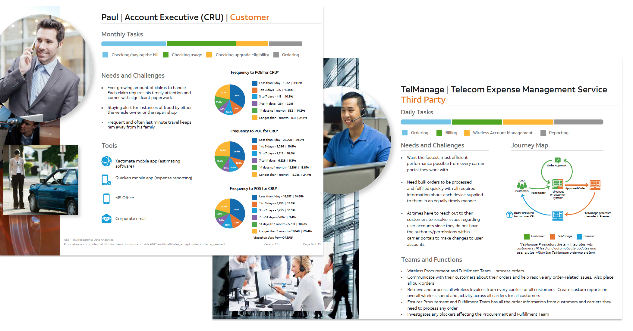
Figure: B2B Wirless Platform Personas

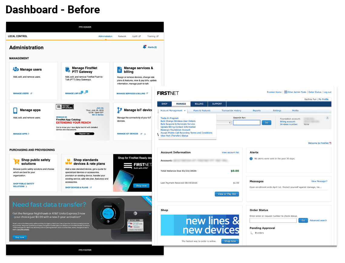
Figure: Dashboard - Before

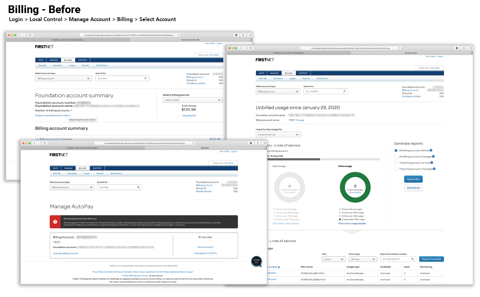
Figure: Billing - Before

Figure: Task Flow Analysis

Strategy & Design

Creating the Minimum Viable Product (MVP)

We gathered our best ideas to create the right solution.
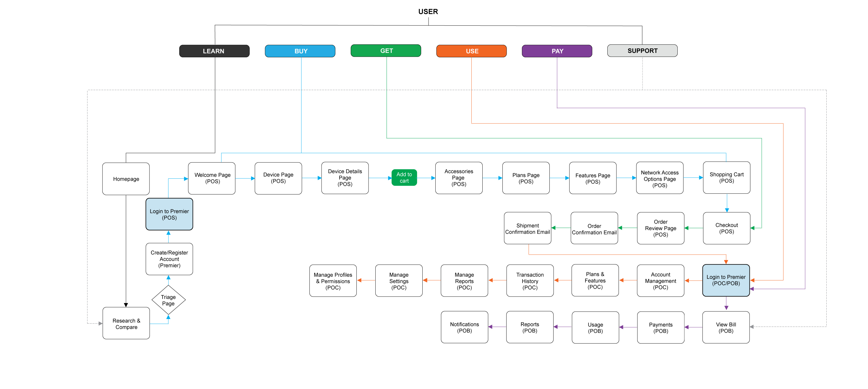
1.

Approach

  • Bring information and tasks to the user
  • Only present content relevant to the user
  • Present a unified whole "single site" experience
  • Incorporate responsive design
2.

Vision

  • Reduce page load times
  • Reduce the number of steps
  • Ability to pay single/multiple accounts from the dashboard
  • Add alerts to dashboard
  • Ability to view wireless information such as devices, plans, and usage
  • Ability to view information related to device, plans and features on the dashboard
  • Provide autopay opt-in/opt-out functionality to the dashboard
  • Provide Autopy Alerts
  • Ability to manage customer information from the dashboard
3.

User Experience - Best Practices

  • Define the purpose of the dashboard
  • Choose the right representation of the data you want to display
  • Combine reporting with activities, but allowing users to interact with the report data to complete their tasks
  • Provide only relevant information and prioritize tasks so that users know what they need to do
  • Provide personalization rather than customization
  • The best dashboards tend not to include more than 6 cards in their initial view
  • Avoid making every element into a task that users need to complete

Figure: Site Map

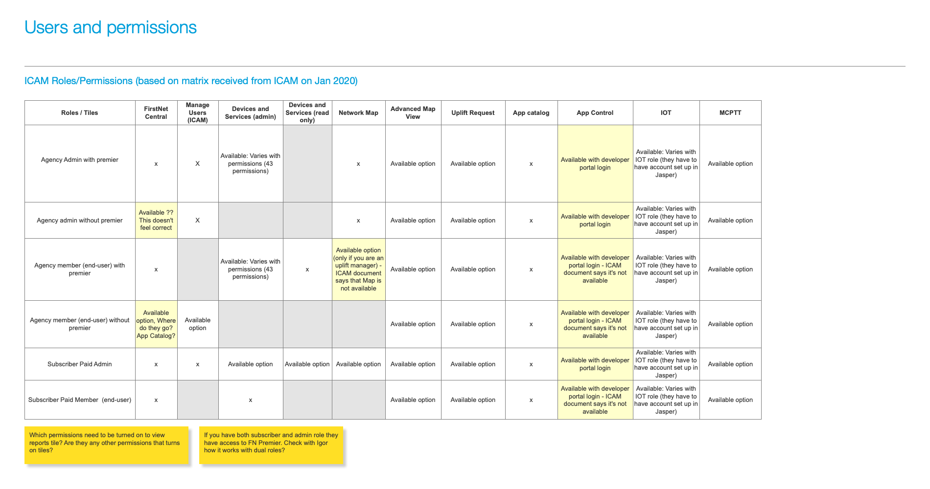
Figure: Users & Permissions
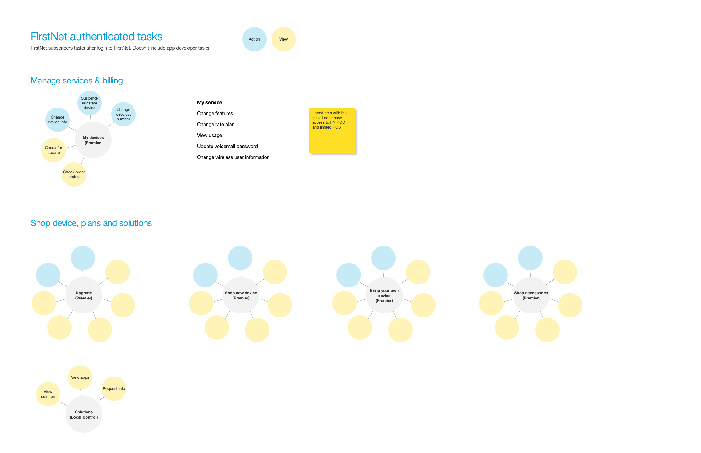
Figure: Task Map

Figure: Flow

Figure: Sketch

Figure: Strawman Wire

Figure: Comp

Validate

Test & Refine

We created interactive prototypes to validate our solution.

1.

Methodology

  • Heuristic Evaluation
  • Unmoderated Rapid Iterative Testing and Evaluation (RITE)
2.

Results

  • SUS Score
    • Mobile - 95
    • Desktop - 91

Figure: Usability Readout

Next Steps

Continuous Improvement

An ongoing effort to improve over time.

1.

Proposed UX Improvements

  • Anlayze Tasks for Agency Administrators
  • Customize the dashboard for Agency Administrators

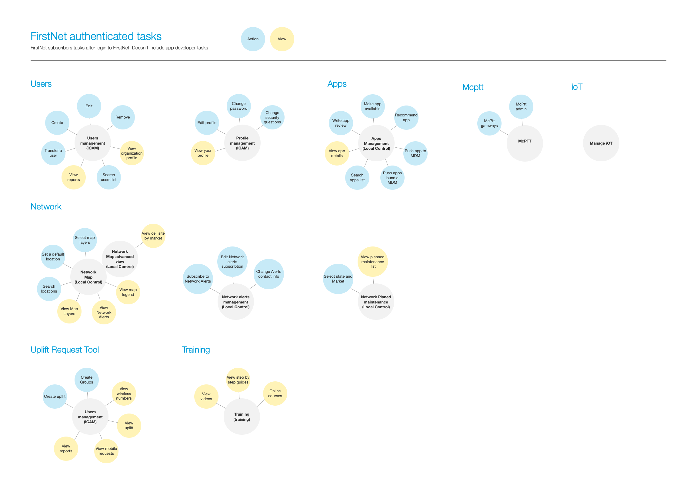
Figure: Agency Admin Tasks

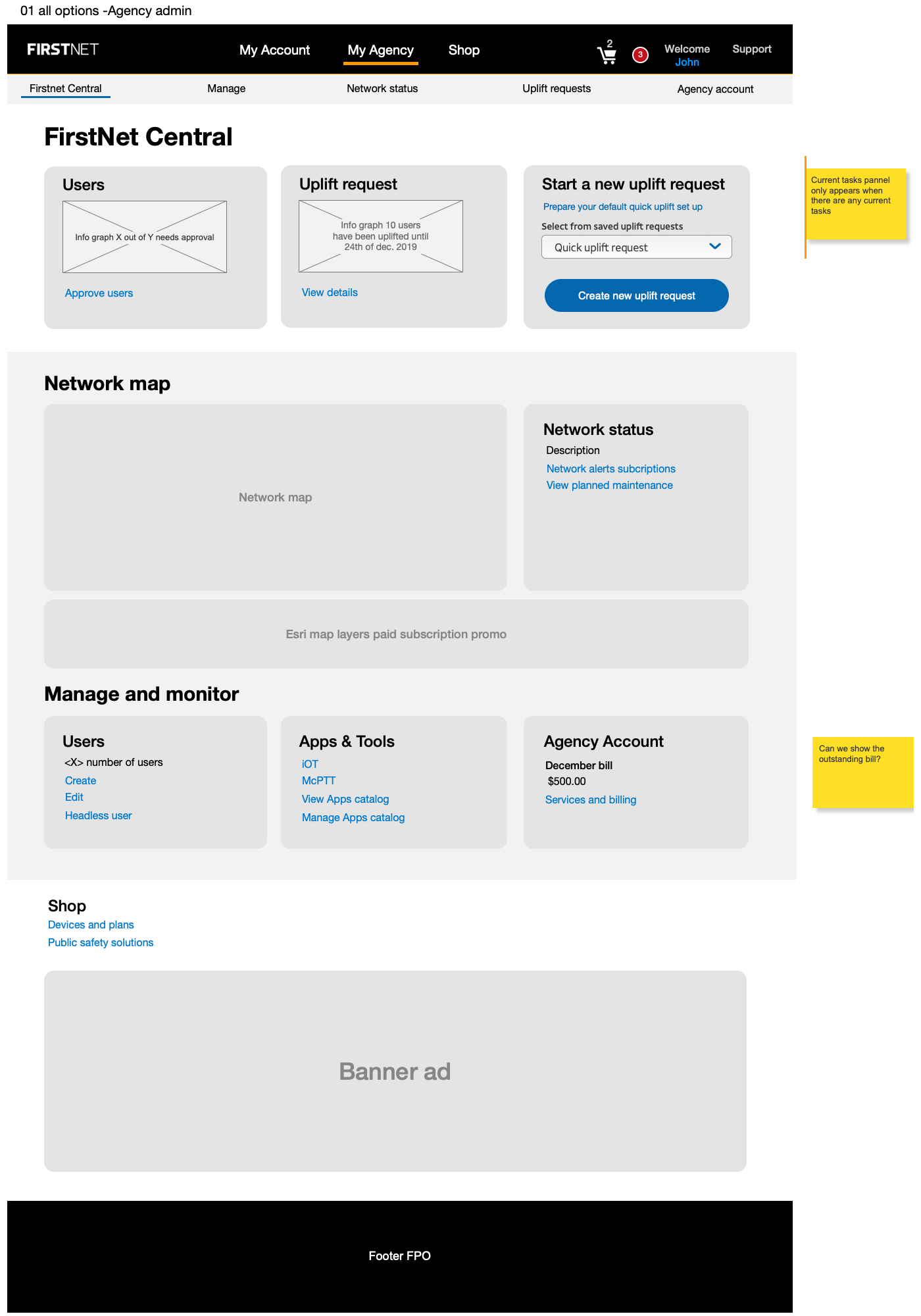
Figure: Agency Admin Dashboard Wire

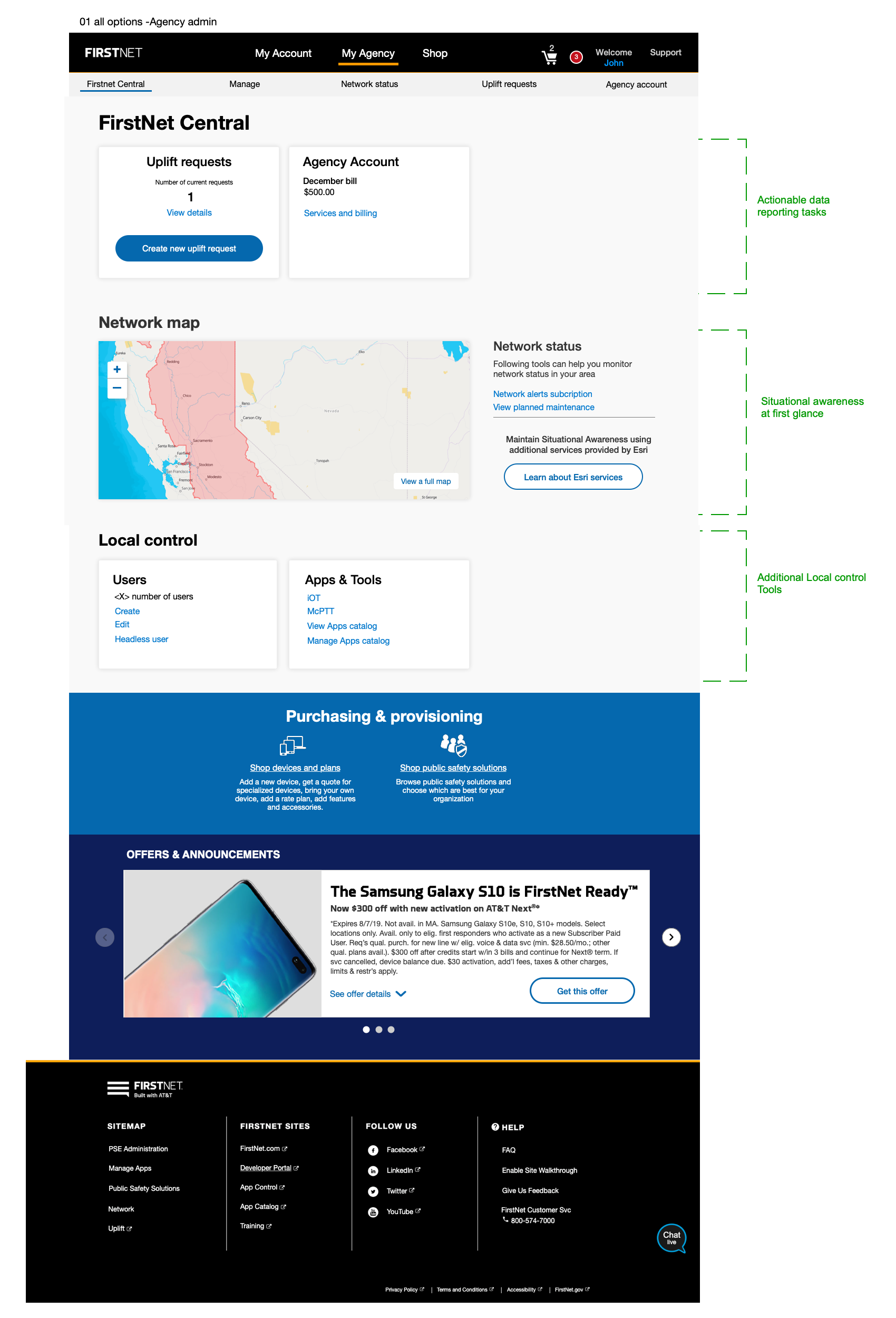
Figure: Agency Admin Dashboard Comp

GET IN TOUCH

Location

Atlanta, GA

Phone

404-775-9863