UX Research & Design Strategy Lead
Rebuilding AT&T's support experience around how customers actually search.
Customers were not struggling because support content was missing. They were struggling because the structure, labels, and pathways reflected internal business categories more than the way customers described their own problems.
I led a cross-functional team across content strategy, SEO, and product to rebuild the taxonomy around customer vocabulary, validate the structure through two rounds of testing, redesign the content for scanning, and give customers clearer paths to the answers they were looking for.
Less calling. More solving.
Four metrics improved post-launch: satisfaction, call deflection, monthly traffic, and time to answer.
ForeSee CSAT improvement post-launch.
Fewer inbound support calls as customers resolved issues online.
Increase in unique monthly visitors following launch.
Reduced dwell on upper-level pages, customers finding answers faster.
The opportunity was to rebuild the support experience around customer language. A stronger taxonomy gave the page redesign a foundation that a visual refresh alone could not have provided.
The opportunity was to rebuild the support structure around customer language.
The research showed that customers needed clearer paths to support content. Customers used different language than the business used internally, support categories did not always match how customers described their problems, and a stronger taxonomy gave the redesign a better foundation.
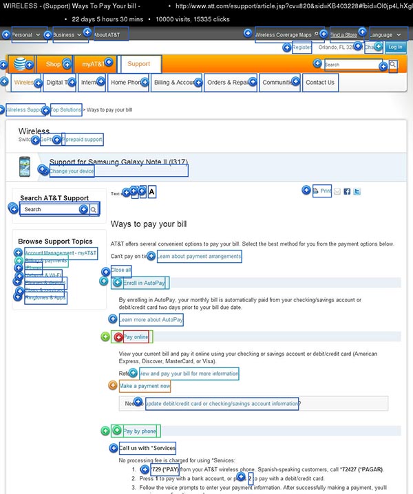
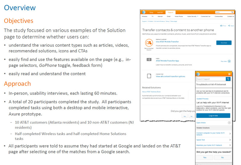
The support experience had a large amount of useful content, but customers had to navigate categories shaped by internal ownership, product lines, and legacy organization. The team needed to understand how customers described their support needs before redesigning the page structure.
I treated the work as an information architecture challenge before moving into page design. I reviewed the existing support structure, customer language, search behavior, and task pathways to understand where customers were getting lost. That work helped the team see the opportunity clearly: reorganize the experience around how customers understood their own needs, then redesign the pages around that structure.
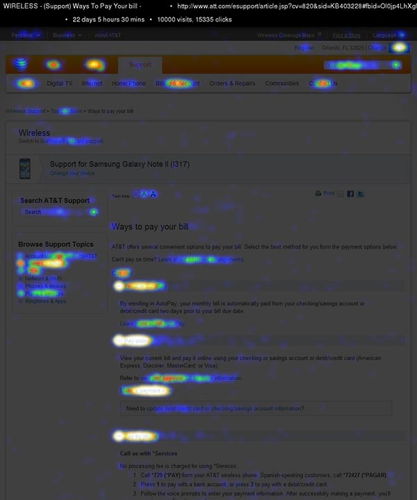
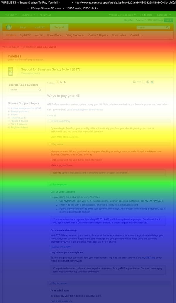
Click analysis, where customers navigated vs. where the IA expected them to go.
The support site contained thousands of articles across dozens of categories. Closing the gap between how content was organized and how customers searched required rebuilding the architecture, not just relabeling pages.
By addressing structure first, the redesign could improve findability and give Product, Content, and UX a shared foundation for future support decisions.
From internal categories to customer-language taxonomy.
The team moved from internally defined support categories to a taxonomy shaped by how customers described their problems — reducing reliance on internal labels and creating a shared structure that Product, Content, UX, and stakeholders could align around.
A better taxonomy made the entire experience easier to reason about. It helped the team make content and navigation decisions based on customer understanding, not internal ownership.
Mixed methods pointed to the same findability problem.
I used a mix of methods to separate symptoms from causes. Customer interviews revealed the vocabulary customers used to describe their problems. Treejack tested findability in the existing IA. A content audit mapped duplicates, gaps, and mislabeled categories across thousands of articles. Path analysis showed where customers actually went vs. where the IA assumed they would. Rather than treating every support issue as a page-level problem, I looked across taxonomy, navigation, content structure, and task completion to identify the common root cause.
The research created confidence before the redesign. Multiple methods pointing to the same issue gave stakeholders a clearer reason to invest in taxonomy and structure before moving into page updates.
Aligning teams before page design began.
Support experiences are often owned across multiple teams. A navigation or taxonomy change can affect product owners, content teams, support operations, analytics, and page design. The team needed alignment before redesigning pages so the new experience would not recreate the same structural issues.
The redesign touched AT&T's content, SEO, legal, and product teams, all of whom had built or maintained the existing taxonomy. Getting alignment meant presenting the research signal as a specific, observable gap: where customers actually went, where the system expected them to go, and what that gap cost in call volume and satisfaction scores.
The click analysis and Treejack data made that case concrete. Stakeholders who had been skeptical of a taxonomy overhaul agreed to proceed once the data showed the misalignment was measurable and systematic, not a design opinion.
This reduced churn later in the process. Once the taxonomy was aligned, page design could focus on clarity, hierarchy, and task support instead of reopening foundational structure decisions.
Rebuilding the taxonomy before redesigning the pages.
The redesign was grounded in a tested taxonomy. Reorganizing support pathways before changing page layouts gave the redesign a clearer rationale: each page decision could be traced back to the structure customers had already validated through research.
I rebuilt the taxonomy around the words customers used, then redesigned support pages around scanning, task priority, and clear paths to answers. The redesign focused on helping customers recognize where to go, understand the available paths, and complete support tasks with less backtracking.
Several legacy category structures were embedded in downstream systems requiring significant engineering to rename. I prioritized the categories covering 85% of search traffic and documented the full taxonomy map in the KMS for future cycles. A phased approach that delivered measurable impact without blocking on a full migration.
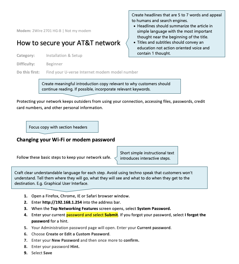
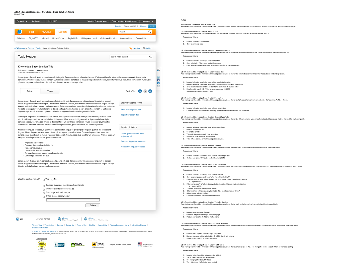
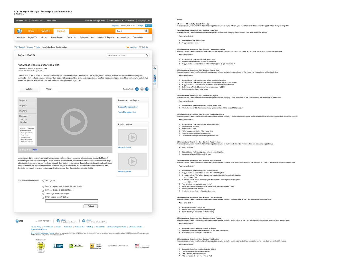
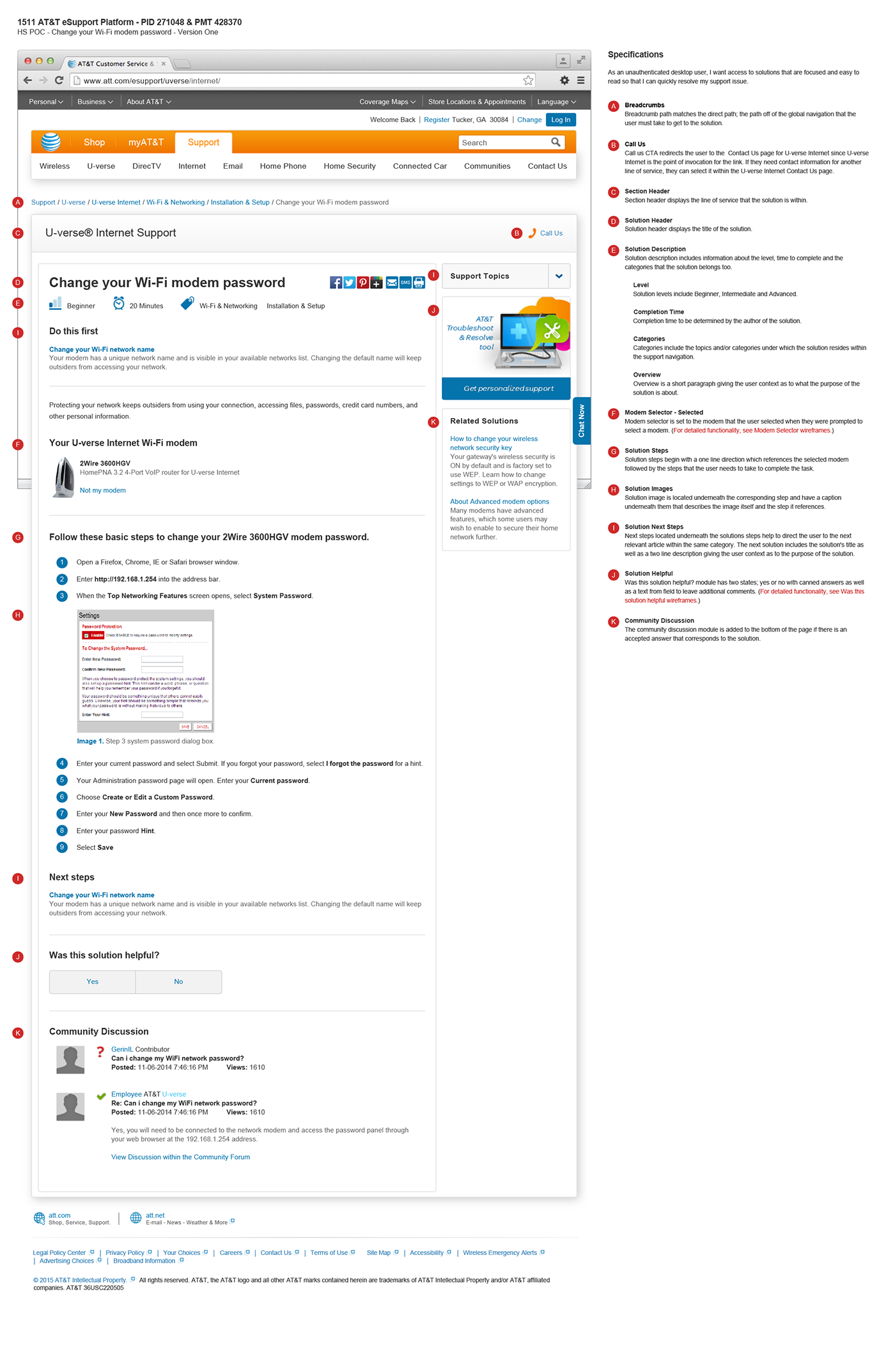
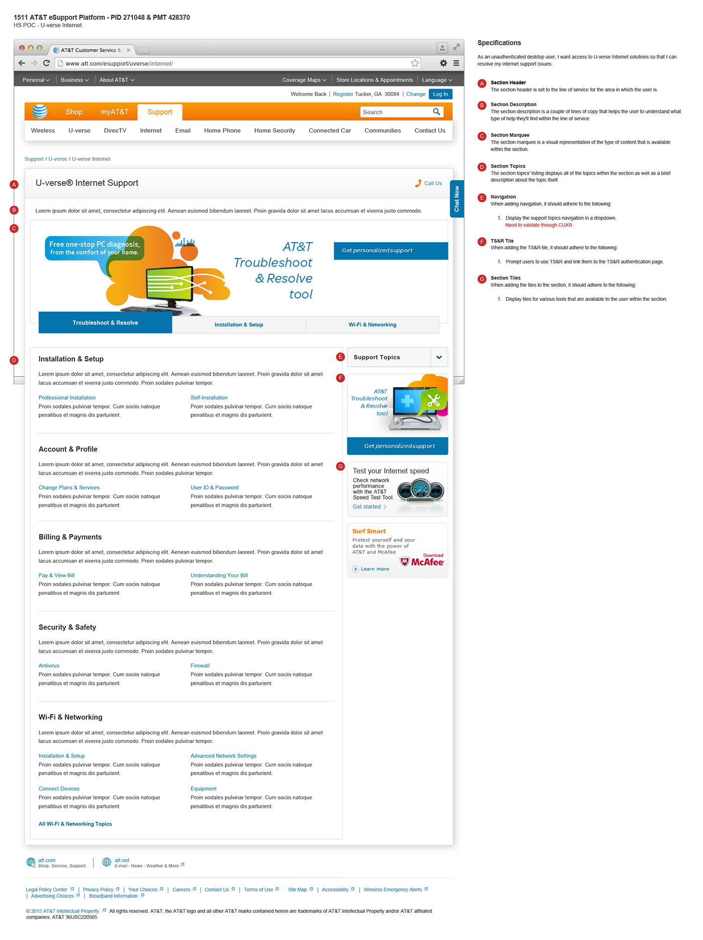
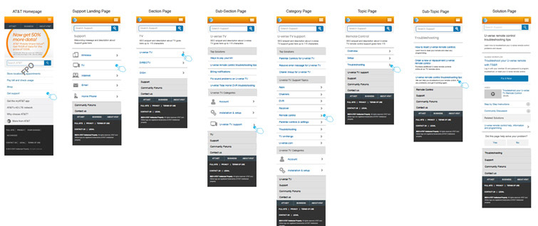
Content structure, reformatted for scanning with clear hierarchy, short paragraphs, and the terms customers actually use when searching.
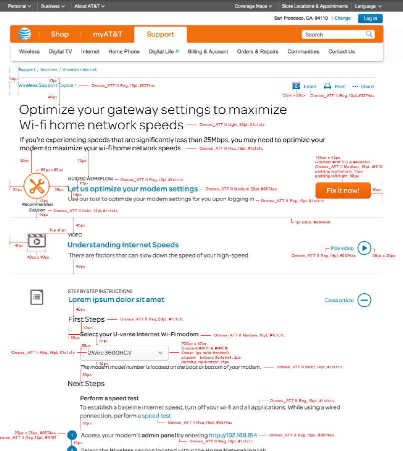
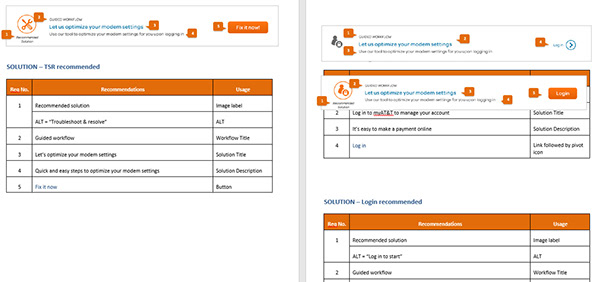
Final comps and redlines, handed to engineering with complete specifications for the redesigned experience.
Because the taxonomy was addressed first, the page redesign had a structural foundation to build on. Every label, grouping, and hierarchy decision could be traced back to validated customer understanding.
Design artifacts
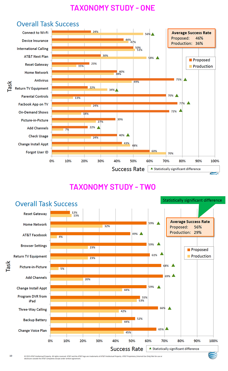
Two rounds of testing. Task success improved both times.
The team tested, learned, revised, and tested again. The first round identified where customers expected support topics to live. The taxonomy was updated based on those results. A second round showed improved task success, validating the direction before broader rollout.
I tested iteratively across labels, page structure, CTA visibility, scroll behavior, and task completion before each build cycle. After the first round, I reviewed task performance and failure points, adjusted the taxonomy, and tested again. Testing turned taxonomy from an opinion-driven conversation into an evidence-based design decision.
| Test Round | Before | After | Gain |
|---|---|---|---|
| Round 1. Taxonomy labels | 36% | 46% | +10 points |
| Round 2. Page structure | 29% | 56% | +27 points |
Taxonomy validation, confirming new category labels matched how customers actually searched, before committing to full content migration.
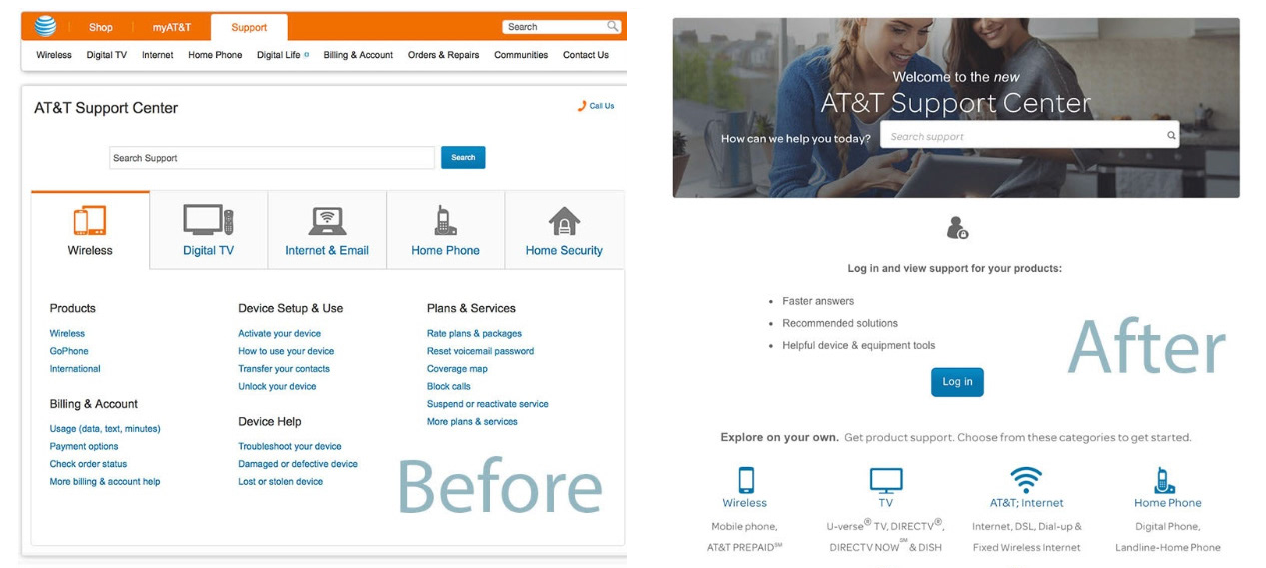
Before & after, the redesigned AT&T support experience.
The team could move forward with more confidence because the structure had been validated with customers. Research turned taxonomy from a preference-driven debate into a decision grounded in evidence.
The most important decision was to slow down before redesigning the page.
At first, the visible opportunity looked like page design. The research showed that the higher-value work was language and structure. Once the taxonomy was clearer, the page design became easier because the team knew what the experience needed to support.
This project reinforced a pattern I have carried into later work: when customers struggle, the answer is not always a new screen. Sometimes the most valuable design work is creating the structure that helps the right screen make sense.
How I built research operations, customer access, design critique, and repeatable practice models across AT&T, Digital.ai, and McKesson.
What This Changed
Rebuilding the taxonomy required alignment across content, SEO, product, and engineering, and a decision to fix the architecture before touching the pages. At AT&T's scale, a small improvement in findability has outsized impact: fewer calls, faster answers, lower support costs.
The KMS governance model kept the taxonomy current after launch. Customers found clearer paths to common tasks, support pages became easier to scan, and the experience reduced pressure on assisted support channels, improving dwell times by 10–15 seconds on upper-level pages.