UX Research & Design Lead · Sole designer and researcher on a team of three, with a game designer and PM · 12-month project
Balancing fun, safety, and commerce for Cartoon Network's 9M+ young players.
Project Exonaut was Cartoon Network's browser-based MMO for children ages 6 to 12. As the sole UX designer and researcher on a three-person team, I designed in-game commerce, character customization, onboarding, platform progression, and faction systems for 9M+ registered users across a 3-year platform lifespan.
The design challenge was to create an experience children could navigate while supporting premium content, virtual commerce, inventory, account creation, and COPPA-aware parent consent — balancing child comprehension, parent trust, platform commerce, and safety requirements simultaneously.
9M+ registered users · 3-year platform lifespan · 40+ Exosuits
A free-to-play MMOG with a hybrid revenue model: premium in-game currency for Exosuit purchases, plus ad inventory value driven by PVP engagement loops. The commerce model had to generate real revenue without dark patterns targeting a legally protected audience.
Browser-based, no download. Zero install friction drove rapid acquisition across CN's audience.
April 2011 through late 2014, sustained through content updates, seasonal events, and IP-tied Exosuit releases.
Characters from Ben 10, Adventure Time, Powerpuff Girls, and Gumball, each with distinct stats, abilities, and monetization tiers.
Free core gameplay with premium in-game currency, plus ad inventory value from PVP engagement.
Children do not debug interfaces. If an action is not immediately clear, they move on. That shaped the design strategy: visible choices, immediate feedback, and forgiving recovery.
Designing for children is the most precise UX problem you can have.
The audience shaped the interaction model. Navigation, feedback, reading level, motor precision, and recovery states all had to be designed for children's actual behavior, not adult assumptions.
The business needed a commerce model that could support virtual purchases without creating confusion, accidental spending, or trust issues for parents — while the product also needed to be genuinely enjoyable for a 6 to 12 year old audience playing on older hardware.
I used direct observation, playtesting, and practical design constraints to shape the experience. CN's playtesting program confirmed the same pattern consistently: features that are not visible are treated as features that do not exist. I designed flows that were explicit, visual, and forgiving, with clear feedback at each step. Parent consent and purchase confirmation were treated as core parts of the experience, not compliance steps added at the end.
Children don't debug interfaces. If an action isn't immediately clear, they move on. That shaped the entire design: legible at first glance, responsive to every action, forgiving of every mistake.
Child behavior constraints
Motor precision
Children's developing fine motor skills require larger interactive targets. All elements were sized above standard tap area minimums to support accurate, confident interaction.
Navigation expectations
Every feature needed to be visible at all times. Flat navigation, no nested menus, no reliance on discovery. If it mattered, it was on screen.
Reading tolerance
Every label short, literal, and supported by iconography. Tutorials delivered through guided gameplay so children learned by doing, not by reading.
Failure tolerance
Every loss framed as a learning moment: losing still earned XP, loss screens stayed energetic, and the visual language kept children motivated across skill levels.
The product needed to be enjoyable for children, understandable to parents, and viable for the business. Designing for those needs together prevented the experience from becoming either too commercial, too complex, or too restrictive.
From game entry to purchase consent.
I designed the commerce path as a guided flow, not a standard adult checkout experience — with a clear path from game entry through browsing, preview, confirmation, and parental consent, and confirmation moments that helped prevent accidental purchases.
The product needed to sell virtual items without violating trust. Children needed to understand what they were selecting, what it cost, and what would happen next. Parents needed confidence that purchases, account creation, and consent were handled clearly.
I mapped the end-to-end path from landing in the experience to browsing, previewing, confirming, and completing parent consent. I designed the shop around visual comparison and character customization because children needed to see what they were getting before committing. The flow included confirmation layers, clear currency presentation, and a parental consent checkpoint at the right moment.
Entry and orientation
Game Template & Home Screen
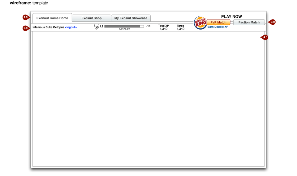
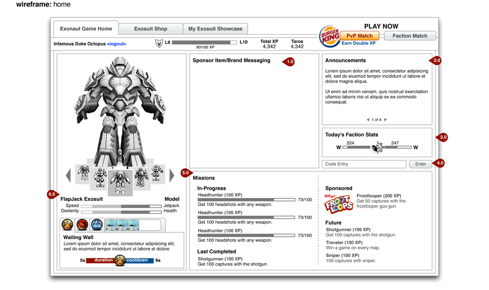
Flat, always-visible navigation. Home surfaced current suit, faction status, currency, and active events without scrolling. Children should never have to search for their current state.
Commerce decision flow
Exosuit Shop & Preview
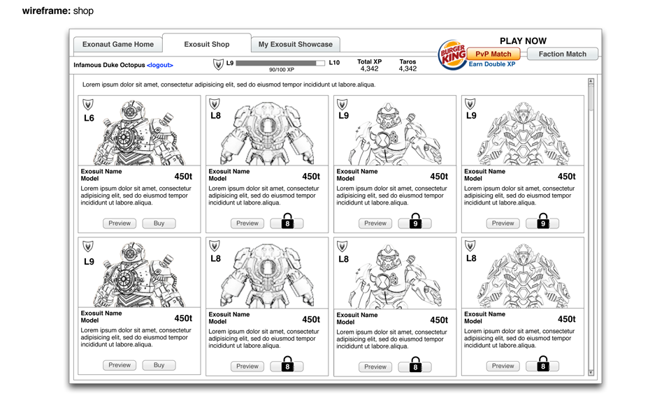
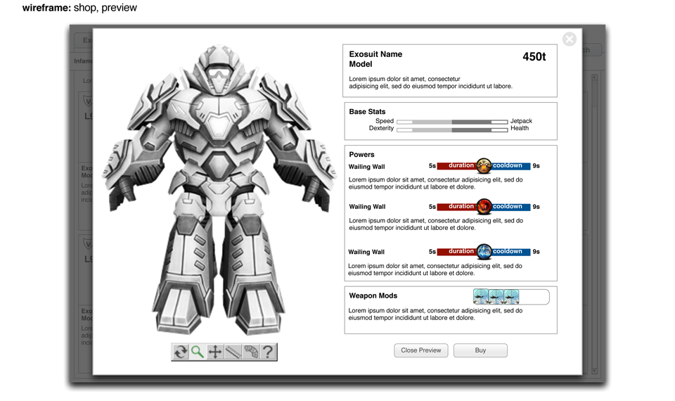
Shop distinguished free and premium suits through clear visual hierarchy, with stats alongside price so children could evaluate value and not just desirability. Preview let players see any suit animate and compare stats before committing. New suits tied to CN's programming calendar created natural urgency without countdown timers.
Purchase safety and consent checkpoint
Purchase Confirmation & Parental Consent
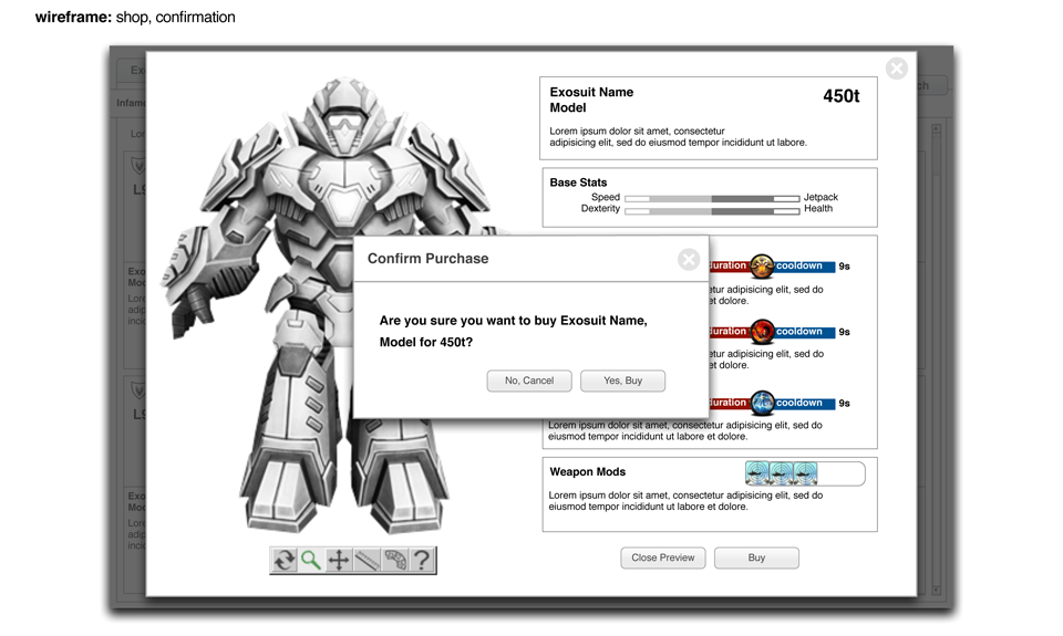
Purchase confirmation and parental consent were designed as part of the flow. Two-step confirmation with full item summary, no hidden costs, no accidental purchases. COPPA parental consent surfaced at the point of payment intent, framed as care rather than a restriction the child encountered as a wall.
A child-facing commerce flow has to do more than convert. It has to create trust. The design supported the business model while reducing ambiguity for children and parents.
Six principles that held across every surface.
The product needed decision rules that could hold across onboarding, gameplay, commerce, inventory, account creation, and safe social features. I created practical principles the team could use to evaluate whether each surface supported child comprehension, parent trust, and platform goals.
Reusable design framework
Clear over clever
Every label literal. Every action needed a label, not just an icon. Abstract menus consistently failed with this audience.
Instant feedback
Visual and auditory confirmation on every action. In a browser without haptics, every action had to confirm itself immediately.
Learn through play
Combat taught through guided first-match. Currency introduced through earned play before real money was ever surfaced.
Failure as reset
Losing still earned XP. Loss screens energetic and humorous, consistent with CN's brand voice, keeping children motivated across skill levels.
Performance as a constraint
The audience played on older hardware. Animation complexity was calibrated for lower frame rates so core loops felt responsive even on less capable machines.
Compliance built in
COPPA-aware consent and account patterns embedded into creation and commerce flows as design features, not legal interruptions.
The principles helped keep the product coherent as the experience grew. They gave the team a way to make tradeoffs when business goals, safety requirements, gameplay, and child comprehension were in tension.
A commerce model built for children, parents, and the business.
Free gameplay created access and desirability. Premium currency supported the business model. Preview and confirmation helped children understand purchase decisions. Parent consent created a trust checkpoint at the right moment. Safe chat and monitored social patterns supported community with guardrails.
Premium content needed to feel desirable without creating pressure or confusion. COPPA-aware account and consent requirements needed to be integrated into the flow. Parents needed to understand and trust the experience, while children needed something that still felt fun, direct, and rewarding.
The commerce system required the most careful design judgment on the project. I designed around earned and purchased value — players could unlock items through gameplay and use premium currency for special items. Purchase moments were intentionally structured with preview, comparison, confirmation, and consent. I also designed account and social patterns around safety: safe chat, guarded social behavior, and clear account boundaries so children could participate without the product depending on unrestricted communication.
Business and safety model
Earned before spent
Players earned in-game currency through gameplay before real money was ever surfaced. By the time real purchases appeared, players already understood the economy and had something to spend.
Free tier meaningful
Free suits stayed competitive. Premium offered variety and IP connection, not a power advantage. Players had real reasons to play without spending.
Preview before purchase
Any suit previewed fully, animated, with stat comparison, before committing. Reduced anxiety, reduced returns, reinforced trust in the purchase flow.
COPPA consent at the right moment
Parental consent surfaced at the point of purchase intent, not at account creation. Two-step confirmation with full summary. No accidental purchases, no hidden costs.
Safe chat only
Pre-selected phrase library, no open text entry, no personal info in display names. Instant report/block tools at the same visual weight as gameplay actions.
COPPA-aware advertising
Marketing and advertising requirements were embedded in the game design from the start. Ad placements positioned to meet child-directed advertising standards while maintaining the gameplay experience.
The product could support revenue without treating children like adult shoppers. The experience needed to earn parent trust while still giving children a reason to play, customize, and return.
Reusable patterns for safe child-facing commerce.
The work created patterns for onboarding, virtual currency, inventory, purchase preview, confirmation, parent consent, and safe social interaction. As the sole designer and researcher, I established the full design language for Project Exonaut, and the interaction principles carried forward to subsequent CN web game projects across the platform's three-year lifespan.
I created a shared design approach that connected game mechanics, commerce, consent, and safety. I also used observation and playtesting to challenge assumptions. If a design did not work for children in practice, it needed to change, even if it looked clear to adults. The strategic challenge was holding four constraints in balance: premium content that supported the business model, child-centered patterns that avoided manipulation, parental consent flows that protected a legally sensitive audience, and advertising placements that met COPPA standards without undermining the play experience.
This project built the foundation for how I think about design in high-constraint environments. The constraints were real: child comprehension, parent trust, compliance, business goals, performance, and gameplay. The work succeeded because those constraints were treated as part of the product strategy, not obstacles around it.
What This Changed
Project Exonaut proved that child-facing commerce can support business goals without losing safety, clarity, or trust. The work connected game entry, inventory, virtual currency, purchase preview, parental consent, and safe social interaction into one coherent product experience that supported 9M+ registered users across a three-year platform lifespan.
The value was not only in the screens. It was in the decision framework: make every action visible, every purchase understandable, every failure recoverable, and every business requirement accountable to the child and parent experience.
Designing for children made the work more precise.
Children do not reward ambiguity. They do not patiently read around a confusing interaction. They show where the design fails through hesitation, repeated clicking, avoidance, and frustration. That made direct observation more valuable than any internal opinion.
This project shaped how I approach complex systems today. Whether the audience is children, first responders, oncology staff, or enterprise users, the principle is the same: understand the real behavior, design around the decision the user needs to make, and make the system clear enough to support that decision without extra explanation.
How I used research, task prioritization, and validation to redesign a high-trust account experience for AT&T FirstNet.