Account Dashboard: Secure account management for first responders and agency administrators
UX Research & Design Lead
Giving first responders account access built around how they actually work.
FirstNet is a dedicated broadband network for public safety. The account experience needed to support two distinct audiences: individual first responders managing their own service, and agency administrators managing devices, billing, permissions, and account access across teams.
I led the research and design strategy to rebuild a complex account experience around the high-stakes tasks first responders needed most — achieving SUS scores of 95 on mobile and 91 on desktop.
SUS 95 mobile · SUS 91 desktop.
Both scores in the "Excellent" range on the System Usability Scale, validated through heuristic evaluation and unmoderated RITE testing across multiple rounds.
Above the 90th percentile, "Excellent" on the System Usability Scale.
"Excellent" range on desktop across all tested task flows.
First responder subscribers on the FirstNet network at launch.
Public safety agencies served across the network.
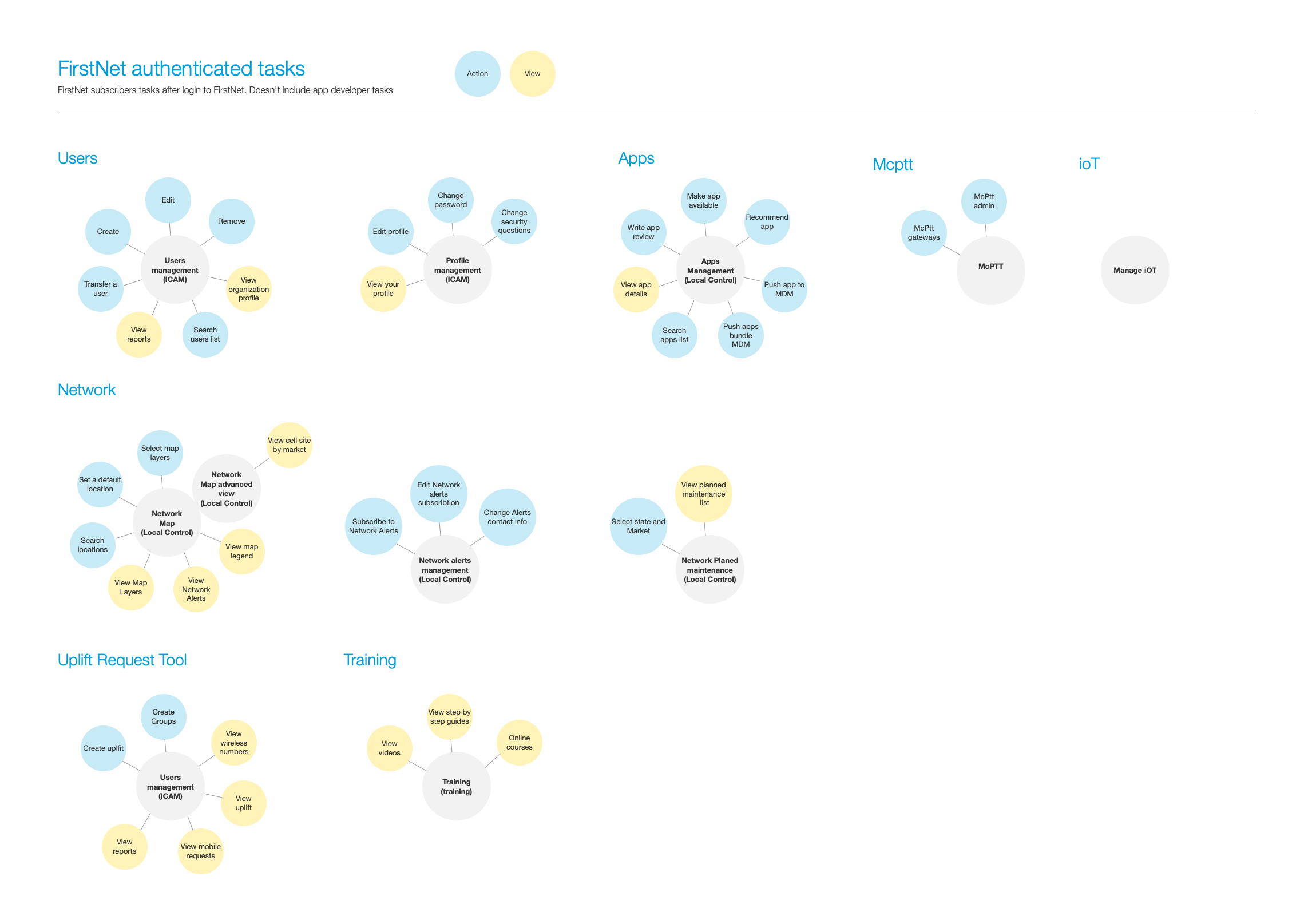
The design challenge was prioritization: deciding what belonged on the surface so first responders could act quickly.
First responders needed account access built around daily account actions.
The research shifted the dashboard from an internal account model to an action-oriented account experience — surfacing billing, usage, device, and AutoPay actions earlier and creating a framework that could scale from individual first responders to agency administrators.
FirstNet subscriber-paid users needed fast, direct access to a small set of high-frequency tasks: pay a bill, check usage, manage a device, enroll in AutoPay. AT&T's Premier platform was built for corporate account administrators managing hundreds of lines. The opportunity was to build a task-first experience on top of that infrastructure.
I grounded the redesign in user tasks. Instead of treating the dashboard as a place to promote content or mirror backend account structures, I focused on what subscribers were trying to do when they signed in. Premier was deeply embedded in AT&T's infrastructure — working within those constraints shaped the approach: identify what could be surfaced and restructured within the existing system, and build the task-access layer on top of it.
35% of all sessions were bill payment attempts. The top 5 tasks (pay bill, setup AutoPay, view bill, shop, account management) accounted for 85% of all traffic. Those five tasks represented the core of what subscriber-paid users came to do. Surfacing them immediately was the primary design objective.
Public safety users do not need extra friction when managing essential service. A task-based dashboard gave users faster access to the account actions that mattered most and created a stronger foundation for future account experiences.
Five research inputs. All pointed to the same opportunity.
I triangulated evidence across research inputs. Think-aloud interviews showed what first responders needed from account management. Expert review identified usability and content hierarchy issues. Adobe Analytics and OpinionLab data showed how users interacted with account areas and where they hesitated. Audience segmentation helped separate individual subscriber needs from agency administrator needs. Each method confirmed the same signal: users knew what they needed to do, but the experience made it harder than it should have been.
The research gave the team confidence to make a structural change. Instead of rearranging existing content, we could prioritize the tasks users were trying to complete and defend a simpler experience with evidence.
"Billing and account set up are a real pain."
OpinionLab survey respondent
"There is no way to pay your bill online."
OpinionLab survey respondent
"The account site access and billing is sub-par."
OpinionLab survey respondent
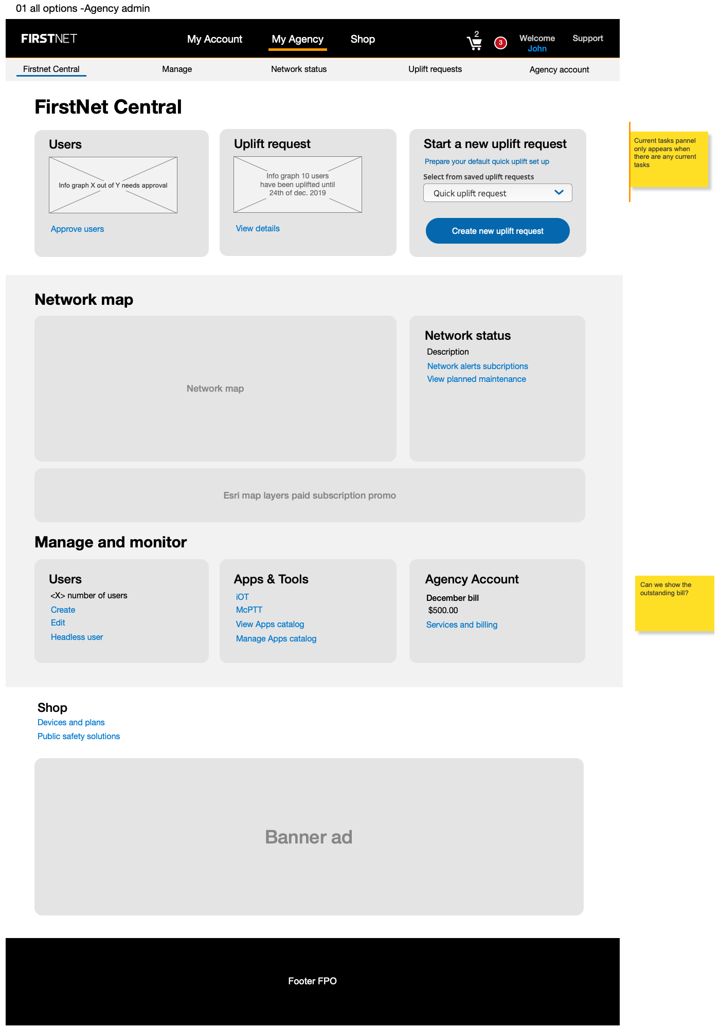
Before
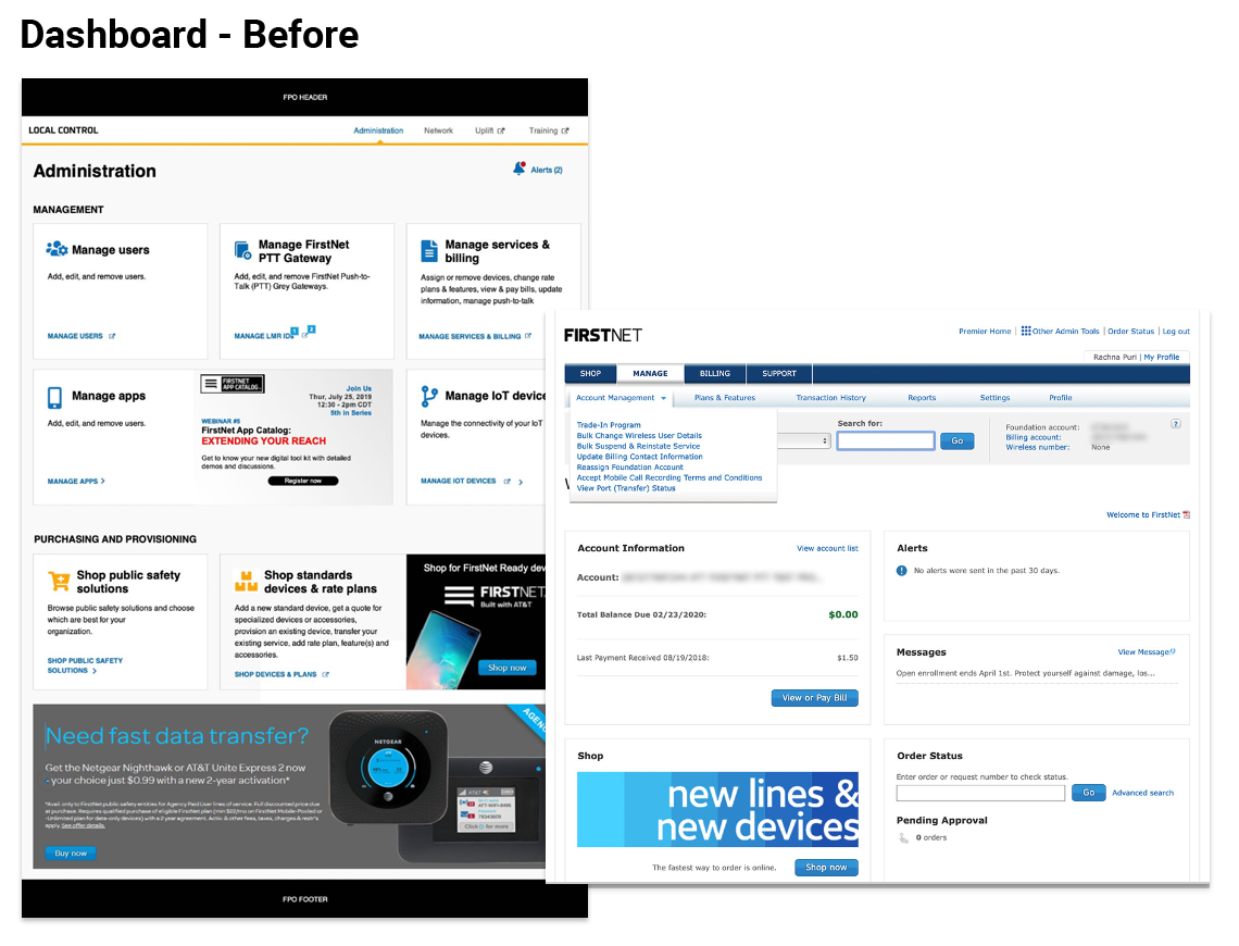
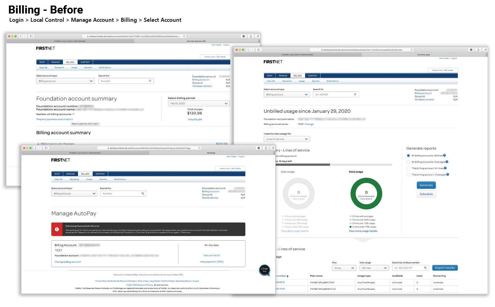
The previous dashboard and billing experience were organized around enterprise account structure. They supported the business, but did not surface key subscriber tasks quickly enough.
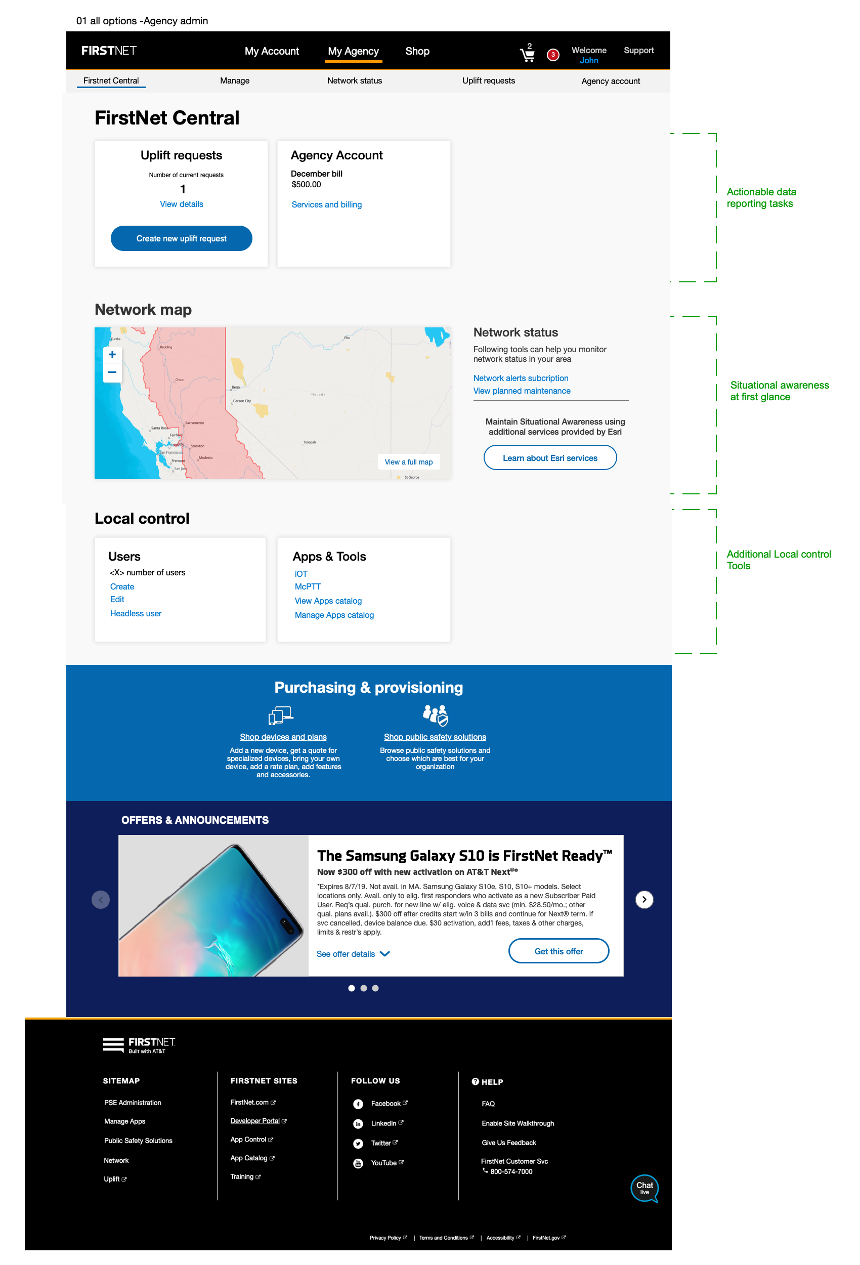
Redesigned around account actions, not account structure.
The redesigned dashboard brought high-priority account actions to the surface, created a responsive model that worked across desktop and mobile, and used a modular structure that could support future account and admin needs without redesigning from scratch.
I reorganized the dashboard around what users came to do. The modular model surfaced high-frequency account actions immediately, reduced navigation depth for bill pay and AutoPay, and applied responsive design across mobile and desktop. I also treated the layout as a modular framework, allowing the team to surface different account modules based on user role, device, and account context.
The dashboard surface is limited. Showing everything meant burying the things that mattered. I capped the initial view at six modules, prioritized by task frequency from the analytics data, and deferred secondary account management to a second tier, reducing the cognitive load for users who came with a specific task in mind.
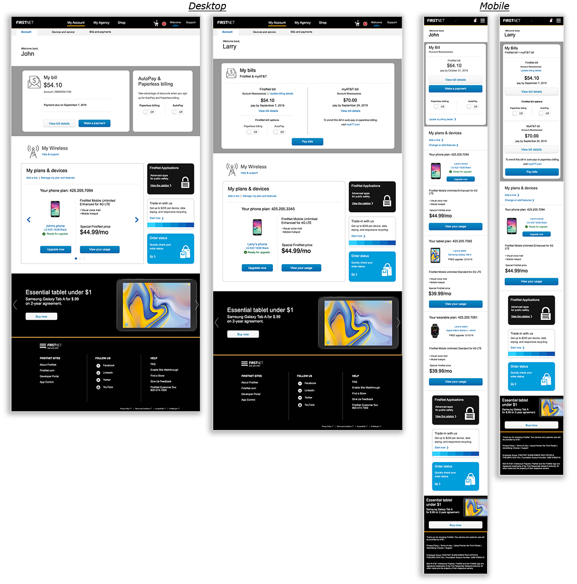
After — top tasks surfaced immediately, AutoPay status visible, role-appropriate account information across mobile and desktop.
The action-oriented structure gave users a clearer path to what they needed and gave the product team a more scalable model for supporting different account types without adding unnecessary complexity.
Tested across multiple rounds before final build.
I validated through heuristic evaluation and unmoderated RITE testing, iterating across rounds before engineering commitment. I used task-based evaluation and SUS scoring to understand whether users could complete key tasks and whether the experience felt usable overall. The final SUS scores — 95 mobile, 91 desktop — both landed in the "Excellent" range, above the 90th percentile.
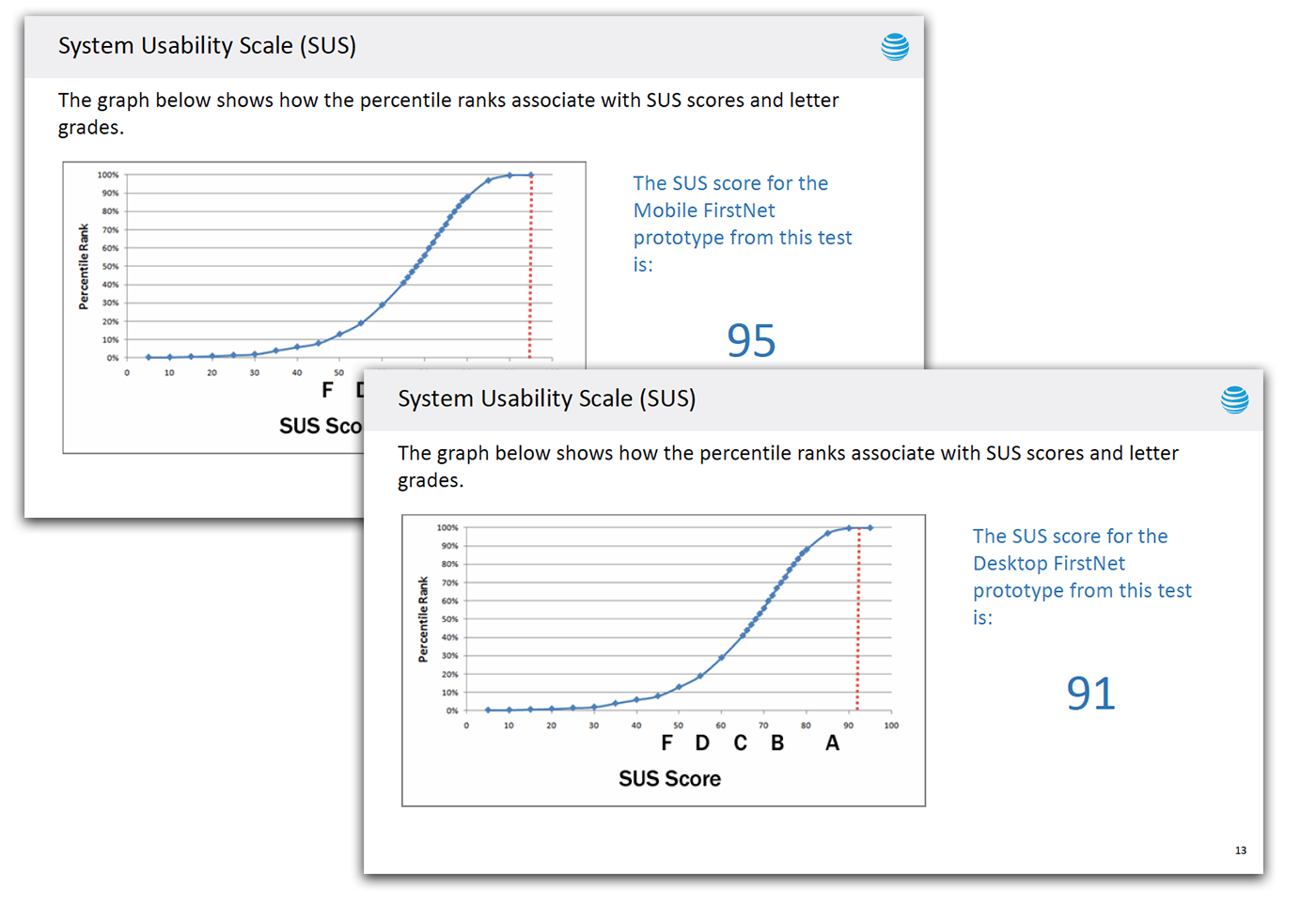
SUS scores and task completion data from the final validation round — both mobile and desktop in the "Excellent" range.
The testing gave stakeholders a clear signal that the redesign was not only visually cleaner. It improved the usability of critical account tasks across device contexts — and gave the team the evidence to move forward with confidence.
The same account framework scaled to agency administrators.
The redesign created a foundation for more complex admin workflows — extending the same modular account framework from individual subscribers to agency administrators who needed to manage accounts, billing, devices, roles, and permissions across teams.
Phase one covered subscriber-paid users, 65% of the FirstNet user base. Phase two extended the same modular account framework to agency-paid administrators — a distinct user type with different permission structures, billing models, and multi-line management needs. I used role analysis and early wireframes to explore how administrators would manage billing, permissions, account access, and line-level actions, preserving the simplicity of the individual subscriber experience while adding the depth administrators needed. Building the first phase with extensibility in mind meant the second phase could reuse the core patterns rather than rebuilding from scratch.
The redesign was not a one-off dashboard update. It created a flexible account framework that supported multiple user types across FirstNet without requiring separate design systems for each audience.
The biggest design decision was deciding what not to surface.
A dashboard can quickly become a collection of everything the business wants users to see. For FirstNet, the higher-value decision was to prioritize the account actions users came to complete: billing, usage, device management, and AutoPay.
This project reinforced a design principle I still use: when users come to an account dashboard, the interface should respect their intent. The goal is not to show everything. The goal is to make the next important action clear.
How I used research, taxonomy testing, and page redesign to improve findability in a high-volume AT&T support experience.
What This Changed
The behavioral data made the design case: 85% of traffic centered on five tasks. Redesigning the surface to put those tasks front and center, within AT&T's Premier infrastructure, produced SUS scores in the "Excellent" range and a modular framework that extended across the full FirstNet user base.
For a network this critical to public safety, an account experience that works without friction isn't a nice-to-have. It's a baseline obligation.